Showing posts with label distress inks. Show all posts

Friday, September 6, 2019

Glow in the Dark Night Scene with Heffy Doodle's Rescue Dog

Hi Crafty Friends!

Today, I created a night scene card with glow in the dark accents and the most adorable super dog ever!


I used Heffy Doodle's Rescue Dog stamp set and an MFT die with for the city silhouette and a Mama Elephant die for the frame.

This super simple card features an ink blended night sky with water drop details, nuvo glitter starts and nuvo glow drop details!

I copic colored the super dog and fussy cut him out so he wouldn't have a white border. I thought that would be jarring against the night sky.

Here is the process video on my channel if you'd like to watch this card come together. Delaney Jane Cards YouTube


All items were purchased with my own funds. This video / blog is not sponsored.

Confused about why I named it all Delaney Jane Cards if my name is Renee’?
This entire thing, shop, YouTube channel, blog, etc, it is all named after our angel daughter who passed away in 2013. I made her some promises when she passed away. I would spread joy, I would make her proud and I would speak her name daily. This is one way we choose to honor her memory, and help me keep my promises.

Speaking of blog, you can check it out at : www.delaneyjanecards.blogspot.com
Check out our online store at: www.delaneyjanecards.com
Want to visit us on Instagram? Check us out at @delaneyjanecards


Monday, June 17, 2019

A Shore thing and Day 3

Today, I had the opportunity to sneak a few minutes in of some crafty time. I am still working through the Pink and Main Crafty Courtyard card kit. I'm working on creating as many cards as possible with these kits to make them worth the cost because it is hard for me to justify the monthly fees for these kits if I can't make a bunch of cards with them. 


These are the three cards I'm choosing to share today. All different but all using this kit. I think being able to create entirely different feeling cards from one kit makes this one a real winner.


This seashell card was actually the last of the three that I made today. It was made up of extras. I had this panel die cut and these left over shells from the other shell card I made. The only thing I had to do was stamp and watercolor the sentiment strip and adhere everything together on a Tonic Studio honey gold panel. So pretty and delicate looking. I finished it off with some of the PnM rose gold gems. STUNNING!


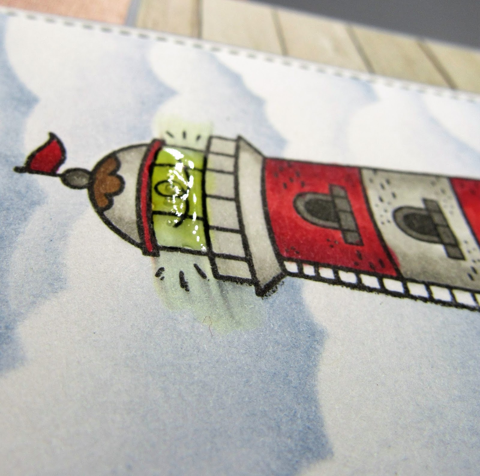
The second card features this amazing light house. I masked the stamped image and ink blended the background panel with some stormy sky distress ink and a honey bee stamps stencil. I layered everything onto some heavy weight cardstock and adhered the panels to the card base. I cut my sentiment stamp (GASP!) so it fit on the wooden planks of the patterned paper, tied a piece of the brown twine to the panel and added a few knots for a nautical look.


A little glossy accents on the light of the light house finished this card. I adore the color combination of this kit and this card.


The final card for the day is something I never thought I'd create. I dry embossed the circle with the embossing folder that came in the kit, Darice's sunrays. I used some abandoned coral and squeezed lemonade distress ink. I masked off the circle with a piece of post it tape I cut a freehand wave pattern from and ink blended the water, broken china and chipped sapphire distress oxide.

I masked off the water and inked up the sand with antique linen distress oxide. I added some water splatters to the image and let them sit and picked the water up with  my towel. And I mounted the circle to a deep gray/ blue cardstock. I heat embossed the sentiment on the water in the little scene with white embossing powder.

I heat embossed the shells with gold embossing powder and water colored with zig clear color markers in pink flamingo and tea rose and blended the color out with the blender pen. I layered these shells on the edge of the circle.

I finished this card off with some spectrum noir sparkle pen, flat back gems, a gold Love from Lizi peel-off and some pattern papers from the paper pad. I popped the circle and shells up on foam mounting tape and tucked those gems in to add more sparkle.


Today was day three of the 30 day coloring challenge by the daily marker.


Friday, April 14, 2017

Faith


With Easter approaching and with most Christians celebrating Good Friday today, I thought a few Easter cards would be appropriate. I started out with this blue version of this card and it morphed into the pink-purple version. Let me explain what happened and how I love them both.


I started with two pieces of Strathmore ready cut watercolor paper and my Ganzi Tambi Watercolor pallet. I put a wash of blue on one piece and a wash of pink with a touch of purple on the other and allowed them to dry.

While those were drying I stamped the Cross image on some Smooth white card stock from MFT in Lawn Fawn Jet Black ink. I colored one using my Copic markers and the other using my Prisma Color pencils. I fussy cut the images and set them aside.

I heat embossed the MFT flourish background stamp in clear on the pink-purple piece and stenciled the SSS morrocan stencil over the blue in stormy sky distress ink, then die cut the panels as well as two additional from MFT's Blueberry cardstock using the Park Ave frame by Mama Elephant.  I also die cut the SSS Painted Faith die 6 times, 3 black and 3 from MFT blueberry cardstock.

The first card went together just as I had envisioned, stacked the frames on top of each other, adhered the center panel directly to the card base. I stacked the blue die cuts on top of each other, stamped the cross and paper pieced the colored image onto the center panel and adhered the Faith die cut over the top. Three SU enamel dots around the cross and some Spectrum Noir Clear Glitter Overlay pen on the sentiment finished it up.

I really like the subtle dimension created by stacking the dies.


I finished the inside of the card with a sentiment and re-stamped the focal image in the stormy sky ink.


For the second card I used the same three main pieces, the Park Ave frame, the same sentiment and the same focal image. Look how different this turned out.


Instead of stacking dies for the frame, I mounted it on two layers of foam tape. Instead of layering the sentiment over the cross image, I used the cross to replace the t in faith. I added a layer of clear glitter overlay pen and a generous layer of glossy accents to the die cut and cross. A scattering of Pretty Pink Posh Sparkling Clear Sequins and some drying time and this card was complete.


I finished the inside the same as the first but used spun sugar distress ink for the cross.


These were fun to create and it was a challenge to use these same pieces two ways.

Thanks for stopping by!

Wednesday, April 5, 2017

Hey Cancer

I decided to give it my best shot at a blog schedule because I realize I miss blogging and sharing my cards and projects. I also miss having a reason to really craft on a regular basis, excluding what I've already committed to (cancer cards, orders, craft fairs and personal use cards). I figured, why not give it a try.  So today I offer this Hey Cancer card.


All the stamps used are from Unity Stamp Company. I heat embossed the heart with the cancer ribbon in clear on a Strathmore Bristol Smooth Cardstock then ink blended distress inks over to reveal the emboss resist pattern. I love how these inks move and blend on this cardstock. They also seem to be softer than on other cardstocks too.


A sentiment heat embossed on some black card stock and cut into a banner with a Simon Says Stamp die popped up on foam tape and a few Pretty Pink Posh Sparkling clear sequins finish this card.


Saturday, February 20, 2016

Day 20 of the 30 Day Coloring Challenge


Day 20 of the 30 Day Coloring Challenge put on by the Daily Marker. Anyone can still join in. Use hashtag #thedailymarker30day


Today I used the C'est La Vie stamp set from A Muse Studio, a circle die and some Tim Holtz distress inks.

I thought this skyline would look really neat with a highlighted circle popped up. And then I thought, it would look really neat with some blended distress inks in the background. AND I WAS RIGHT!


I stamped the image twice, once on the card base and once on a piece of sugar card stock. Then I blended the distress inks over the image on the extra piece of card stock. Die cut the image. Added foam tape, popped up the image over the base image, being sure to match up the lines... and that was it. I love how this turned out.


A Muse Studio Products Used:
C'est la vie stamp set
Sugar cardstock
3d foam adhesive

These products and more can be purchased here: Renee's A Muse Studio Store