Showing posts with label tonic studio. Show all posts

Wednesday, October 2, 2019

Layering Embossing Powder And Adding Shimmer

I pulled out some older sets from my stamp collection today and used these large Fiskars sets. The background stamp is from Henna Petals and the sentiment is from Friends Forever Quotes. Both have been a part of my stamp collection for several years.


I layer heat embossing today as one of my techniques making this card. I heat embossed a sentiment over a heat embossed background. A very cool technique that will leave people wondering how you did that.

Also, today I my voice over was visited by my current favorite 2 year old...  I didn't redo my voice over because I'm not sure I'll find the quite time to retry. So enjoy a little from Ryker along the way. ;)

You can listen for my special guest and watch this card come together here: Delaney Jane Cards

All items were purchased with my own funds. This video / blog is not sponsored.

Confused about why I named it all Delaney Jane Cards if my name is Renee’?
This entire thing, shop, YouTube channel, blog, etc, it is all named after our angel daughter who passed away in 2013. I made her some promises when she passed away. I would spread joy, I would make her proud and I would speak her name daily. This is one way we choose to honor her memory, and help me keep my promises.

Speaking of blog, you can check it out at : www.delaneyjanecards.blogspot.com
YouTube is at:  https://www.youtube.com/channel/UCyFZ3_vCTd3EohFMlGfRODQ
Check out our online store at: www.delaneyjanecards.com
Want to visit us on Instagram? Check us out at @delaneyjanecards
Facebook: https://www.facebook.com/delaneyjanecards/
Email: delaneyjanecards@gmail.com


Tuesday, September 3, 2019

Mirror Card Using Unity Stamps

Hello Crafty Friends!

Today I made some very encouraging cards using some Unity Stamp Company stamps. I've had these stamps for a while and to be honest, I'm a huge fan of Unity Stamp Co stamps. I always get a great image with their red rubber stamps.

Being a small business myself I absolutely love that I can support a small business when I purchase from Unity. Unity is located not far from me, about 4-5 hours away, in Minnesota. I've been purchasing their stamps for a very long time and have a fairly elaborate collection of the red rubber goodness they cook on-site to order!

Ok, well we are all here for the cards, so let's get right to it.


I've been trying to really encourage others lately. When I find myself in need of encouragement most, I try to encourage others as much as possible. I am a firm believer that what we put out into the world, we get back.

I wanted to remind women that when they look in the mirror they are not seeing the version of themselves that others see. We often pick and poke at ourselves in a way that is detrimental to our mental health.

I created scene cards where the woman was looking in the mirror. And the mirror is really a mirror.

I used Tonic Studios brushed silver cardstock. If you haven't checked out their papers yet, I'm sorry but your wallet will be mad!

I created the frame with a beautiful die from Spellbinders. It is actually a locket die but with a little trimming and a snip, it becomes a beautiful mirror frame.

Check out my video and see how these beauties came together!Delaney Jane Cards YouTube


Thanks for stopping by! -Renee'

Thursday, June 20, 2019

Day 6 and I felt like Dory!

Have you seen that movie, the one where the blue fish continues to say Just keep swimming... ?


This card was my keep swimming moment of the week, for sure!


I embossed the image on white bristol smooth cardstock. I had envisioned water coloring these flowers with sepia tones. I did what I thought would have accomplished just that but, it did not look nice at all. I almost threw this card panel away. I never do that, but I almost did.


I got up from the craft desk and did some housework and went back to it. I figured I could splatter brown and gold splats on the image and maybe that would help. NOPE, still hated it.

I got out a stamp set that has splatters and swatches you can stamp so it looks random but it really is controlled... I stamped that on the image. STILL HATED IT!

I left it alone for a little while and did more housework. When I went back to my desk I actually picked it up to throw it away and then decided, to ink blend over it because maybe it would help. I thought it couldn't hurt. I was ready to throw it out anyway. So I ink blended distress oxide inks over the entire panel, image and all. AND... it looked like leather. I actually sort of liked it.

I decided to stamp a sentiment and then use those zig clean color real brush markers to add some deeper color inside the sentiment letters.

I layered the panel onto a piece of gold tonic cardstock and then onto dark brown.

I love how this ended up. It looks so regal and beautiful and stunning and warm and I was so excited to share it. 

Moral of the story for day 6 of this coloring challenge, keep swimming, that blue fish has it right.


Monday, June 17, 2019

A Shore thing and Day 3

Today, I had the opportunity to sneak a few minutes in of some crafty time. I am still working through the Pink and Main Crafty Courtyard card kit. I'm working on creating as many cards as possible with these kits to make them worth the cost because it is hard for me to justify the monthly fees for these kits if I can't make a bunch of cards with them. 


These are the three cards I'm choosing to share today. All different but all using this kit. I think being able to create entirely different feeling cards from one kit makes this one a real winner.


This seashell card was actually the last of the three that I made today. It was made up of extras. I had this panel die cut and these left over shells from the other shell card I made. The only thing I had to do was stamp and watercolor the sentiment strip and adhere everything together on a Tonic Studio honey gold panel. So pretty and delicate looking. I finished it off with some of the PnM rose gold gems. STUNNING!


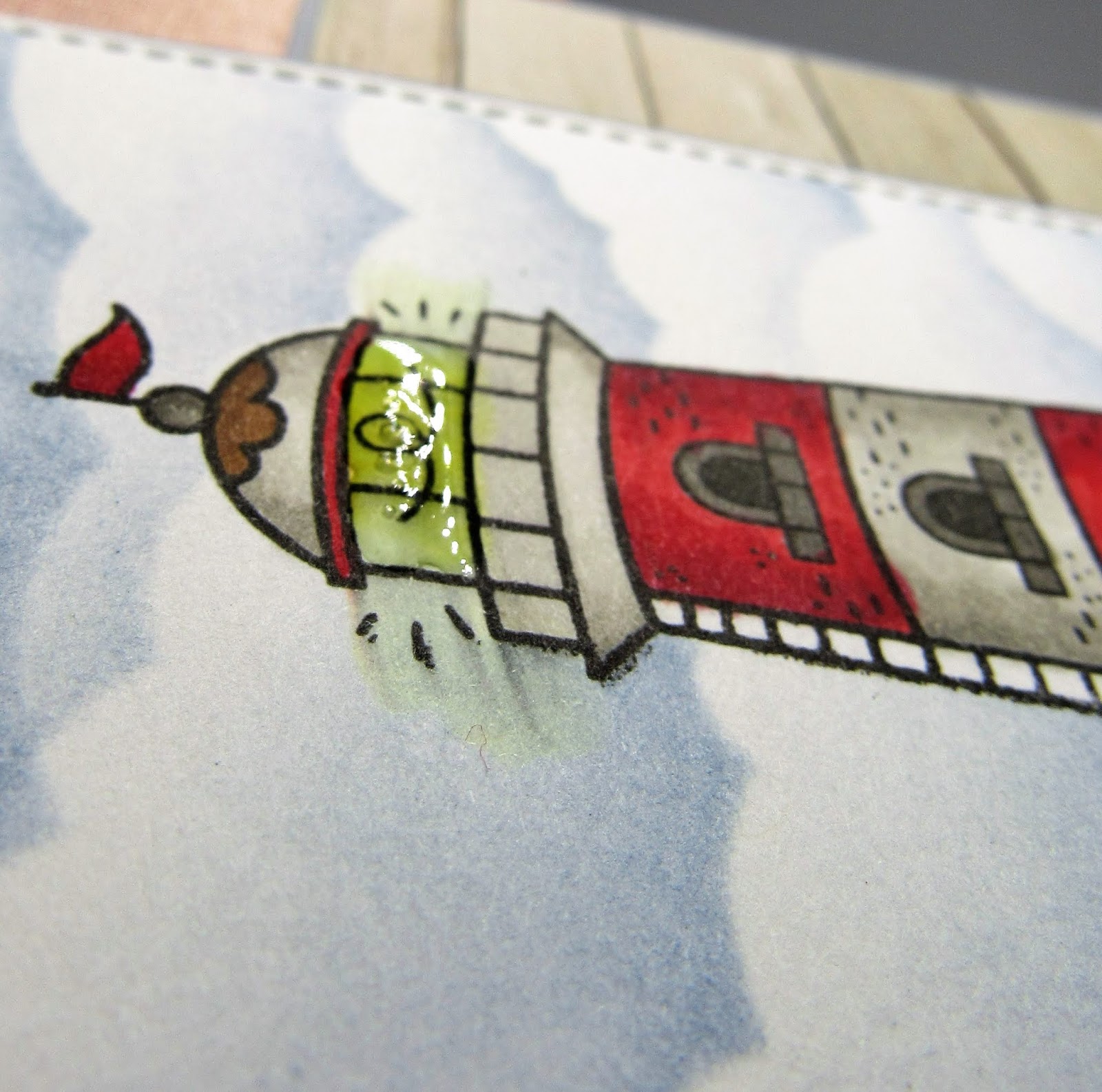
The second card features this amazing light house. I masked the stamped image and ink blended the background panel with some stormy sky distress ink and a honey bee stamps stencil. I layered everything onto some heavy weight cardstock and adhered the panels to the card base. I cut my sentiment stamp (GASP!) so it fit on the wooden planks of the patterned paper, tied a piece of the brown twine to the panel and added a few knots for a nautical look.


A little glossy accents on the light of the light house finished this card. I adore the color combination of this kit and this card.


The final card for the day is something I never thought I'd create. I dry embossed the circle with the embossing folder that came in the kit, Darice's sunrays. I used some abandoned coral and squeezed lemonade distress ink. I masked off the circle with a piece of post it tape I cut a freehand wave pattern from and ink blended the water, broken china and chipped sapphire distress oxide.

I masked off the water and inked up the sand with antique linen distress oxide. I added some water splatters to the image and let them sit and picked the water up with  my towel. And I mounted the circle to a deep gray/ blue cardstock. I heat embossed the sentiment on the water in the little scene with white embossing powder.

I heat embossed the shells with gold embossing powder and water colored with zig clear color markers in pink flamingo and tea rose and blended the color out with the blender pen. I layered these shells on the edge of the circle.

I finished this card off with some spectrum noir sparkle pen, flat back gems, a gold Love from Lizi peel-off and some pattern papers from the paper pad. I popped the circle and shells up on foam mounting tape and tucked those gems in to add more sparkle.


Today was day three of the 30 day coloring challenge by the daily marker.


Wednesday, June 12, 2019

Cards for the Relay for Life

Every year my mom and her twin sister participate in the local Relay for Life at our local fairgrounds. My aunt always makes a bunch of quilts and they raffle them off. This year I was asked to create two sets of cards to be raffled off. One featuring birthday cards and the other being a wedding set.


I was allowed to be creative with this and didn't have any other parameters, and honestly, I work best like that.


I made two cards with some gold embossing details with a Stampendous stamp I've had for a very long time. Which, I guess you'd find a lot of, stamps I've had for a long time. So I chose to do two of this style, one in red and one in cream and white. Both feature a beautiful honey gold paper to accent the embossed details.


The other two birthday cards in this set are made with an even older stamps set. This one was purchased back in 2009 to make a birthday card for my oldest son. He was into magic and I made a card that was called a magic slider card for him. I'll have to make another one to see if I can recreate in.

Anyway, the cards both feature some brightly colored patterned papers from a scrapping for less monthly card kit. I believe it is their own paper. I used the Inkadinkado stamp set to emboss the image on white cardstock and then ink blended over the top with distress oxide inks creating a rainbow background. I added a few sequins and a small stamped sentiment from a much, much newer stamp set by Simon Says Stamp. A few scallop die cuts across the top of the cards feature a new to me stamp and die company, Pink and Main. Their dies are bright pink which I like because they don't get lost as easy on my crafting desk. You'd be surprised what I can lose on that large desk!


The other card set is a wedding set. There are four cards all featuring gold, pink, black and grey. I've created cards starting with engagement and they include bridal shower, wedding and anniversary. A true complete wedding package.


The engagement card features a brand new stamp company and a super awesome stamp set. The stamps are from Colorado Crafts and I've found myself drawn to their sets. All of them feature the feet of whatever the characters are doing. This one, as you can see,  is a gentleman asking his lady to be his wife. Some beautiful golden accents and some dimension make this card super special.


The bridal shower card coordinates with the use of gold. A pretty card that will be passed around at the shower for sure. A gold heat embossed wooden butterfly embellishment adds some very special sparkle to this little beauty.


The wedding card features two champaigne flutes with bubbles, the same gold, pink, black and white color pallet and ties together with the other cards with pattern and style. Details like glossy accents and gold stamping and beautiful die cut edges help this card stand out.


Why not send a coordinating card for the couple's first anniversary. Although this card does not feature an anniversary sentiment nor a number 1 to distinguish a first anniversary, this card would be a welcome token or remembrance for a first anniversary.  However, this card can be used as another wedding card or even a separate anniversary card. A coordinating color pallet of pink, gold, black and white ties this together with the other cards.

Although these cards were a special order and are already spoken for, similar cards can be found on my online store. www.delaneyjanecards.com