
I visited the color throwdown challenge blog and was immediately inspired to create this card. The color combination was Dark Red, Golden Yellow, Blue and White. Other neutrals are allowed to help create a cohesive look. I have wanted to pair these two stamp sets since forever and figured today was as good of a day as any to create this.
This week was color throwdown #450 and here is the inspiration piece

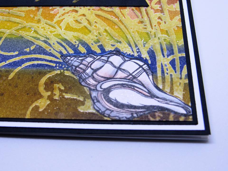
I stamped the seashell onto a piece of Bristol Smooth Cardstock in Intense Black ink and masked it using a piece of post-it tape. Then I stamped the large beach grass with Fossilized Amber Distress Ink using my MISTI. I stamped it several times to get a good impression and leaving my paper and stamp positioned in the MISTI I then used Versamark ink to stamp over top. Then I heat embossed the beach grass with clear embossing powder. This created a mask for my grass so I could put the background on the card front after and the ink would be resisted.
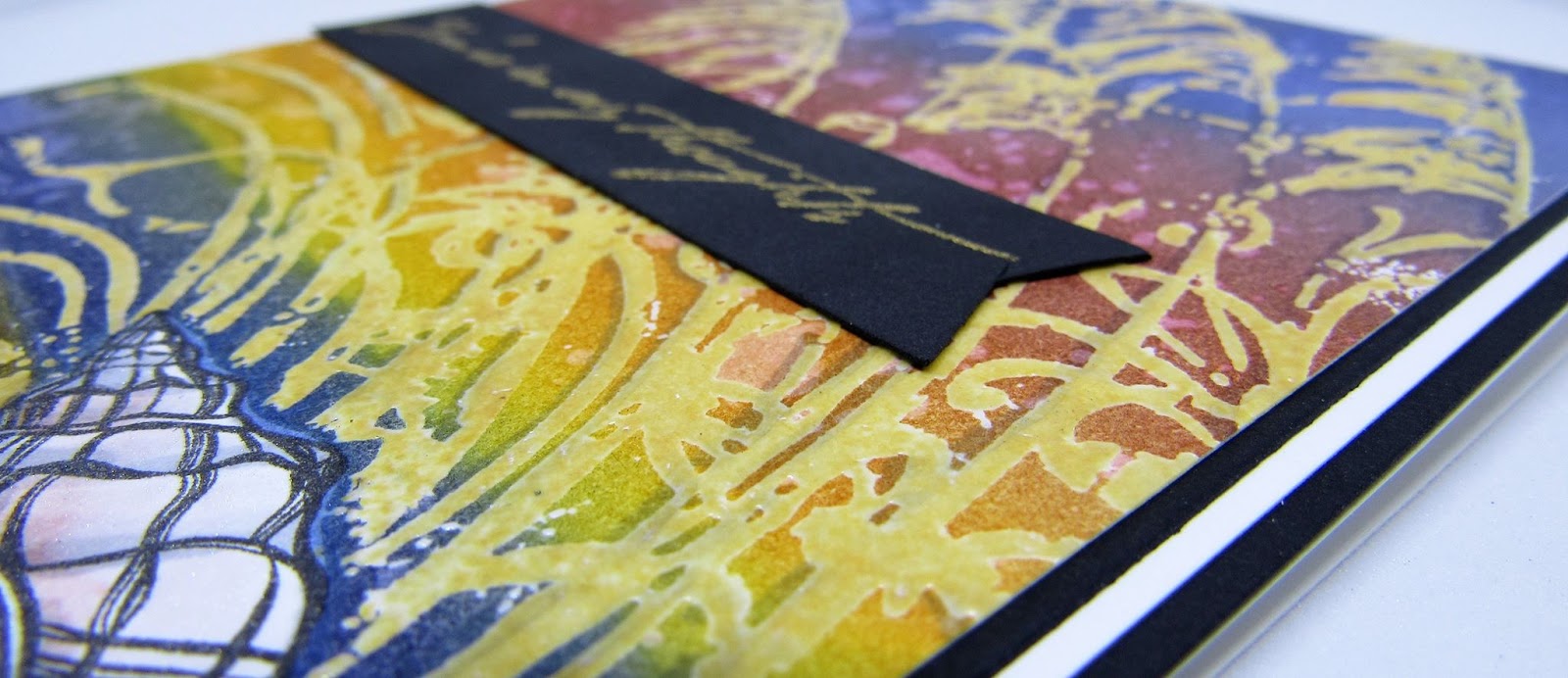
I used another piece of post-it tape to mask off a beach and then blended with more distress inks. I used antique linen and gathered twigs to create the beach. I blended in the water with chipped sapphire and the sky was scattered straw and fossilized amber then fired brick and more chipped sapphire.

Then I removed the masks revealing a nice clean line between the beach and the water and a pure white seashell. I added some texture and shading with my copic markers on the sand and under the seashell. I used my cool grey copic markers to add shading to the seashell and to the beach grass. I added a little of the brick red with a water brush to the seashell to add some color, and then I used a versafine pen to color over the spaces on the shell. Versamark is a clear sticky ink and many things stick to it. I used it for embossing my image, now I used it to add Perfect Pearls in the color perfect pearl to add that mother of pearl look to the shell. It is more visible in real life than in the photos.
I used the versafine again when I heat embossed the sentiment on the sentiment banner. This card reads: You're in my thoughts.

I matted the main image panel with a thin border of black and then with white and black again. I thought it made this card look like a piece of artwork.

The inside is finished with a coordinating stamped image and a sentiment that reads:
Seashells remind us that every passing life leaves something beautiful behind.

I'd love to know what you think of today's card. Please leave me a comment below.

You can visit me on Facebook at Because of Delaney Jane Cards
You can shop my Etsy shop at DelaneyJaneCards
Stunning design! Love the sea oats with the single shell against the vibrant colors! Thanks so much for joining us at Color Throwdown!
ReplyDeleteThanks Wanda, I just saw the next challenge's colors and got all excited. I think I love the color throwdown because I really get inspired.
ReplyDelete